Why do they bother to name colors things like "Churchill Hotel Maple," "Mark Twain House Tan," and "Strawberry Malt" . . . ?
Why don't they just keep it real and say, "Use this color and your project will turn out the exact same color as Silly Putty."
If they used better titles, I might not be confused whether I should use my desk to write on or press it against the Sunday comics to make prints.
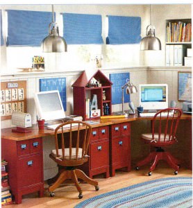
Remember my inspiration desk? Isn't that a nice color stain on the top? Turns out that it's impossible to achieve that honey0colored-wood look on a door that was meant to be painted. First I tried yellow. The desk looked like it belonged in McDonalds. Next, I went for a light tan--hoping for an unfinished wood color. The result--just like I said above--Silly Putty! I decided I had spent enough on paint and I had to live with it this time! Since there will be plexiglass across the top, I can always put fabric, wallpaper, or wrapping paper on the top of the door. Maybe I'll eventually find something better. (I can always dream, but in the meantime . . . Silly Putty is here to stay. Sigh.)


Leave a Reply